Microsoft is moving forward with the process of updating its icons in Windows 10, and a new wave of system icons in File Explorer are next in line for a refresh. Many of the icons being changed have been the visual representatives for important locations on Windows devices for years. They'll still have the same functionality after the update is complete, but they'll come with a newer take on the design.
The latest evolution of Windows 10 icons began more than a year ago, with the icons for Alarms & Clock, Calculator, Mail, and Calendar all undergoing a transformation as part of Preview Build 19569.1000. In the year-plus since, updates have followed to the Windows 10 Start Menu and Tab design, the icons for Windows Security, Narrator and Notepad, as well as changes to make it easier to access news and weather tile information in the Windows 10 taskbar. Even with all these changes. Microsoft hasn't forget about the rest of its icons.
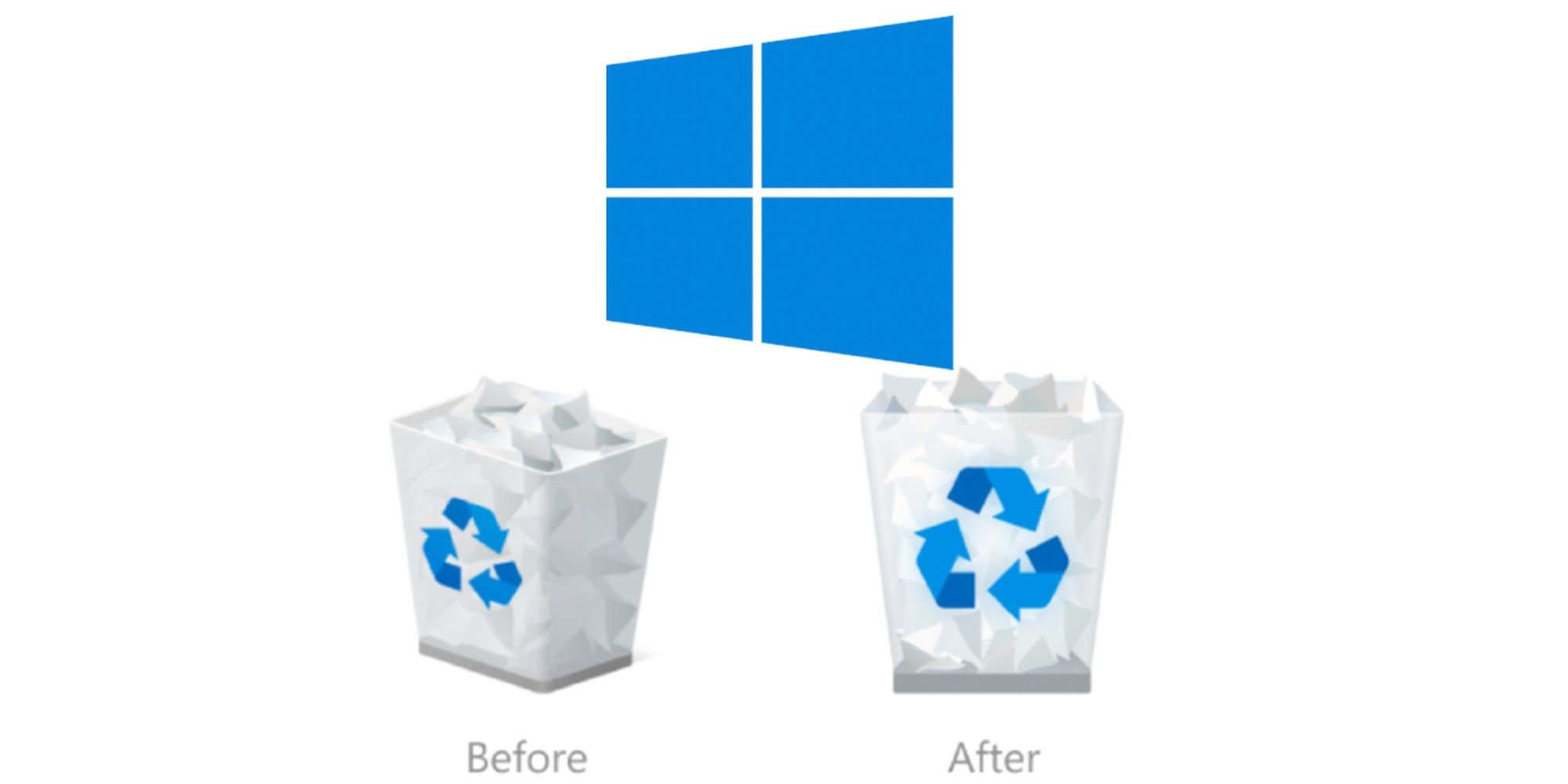
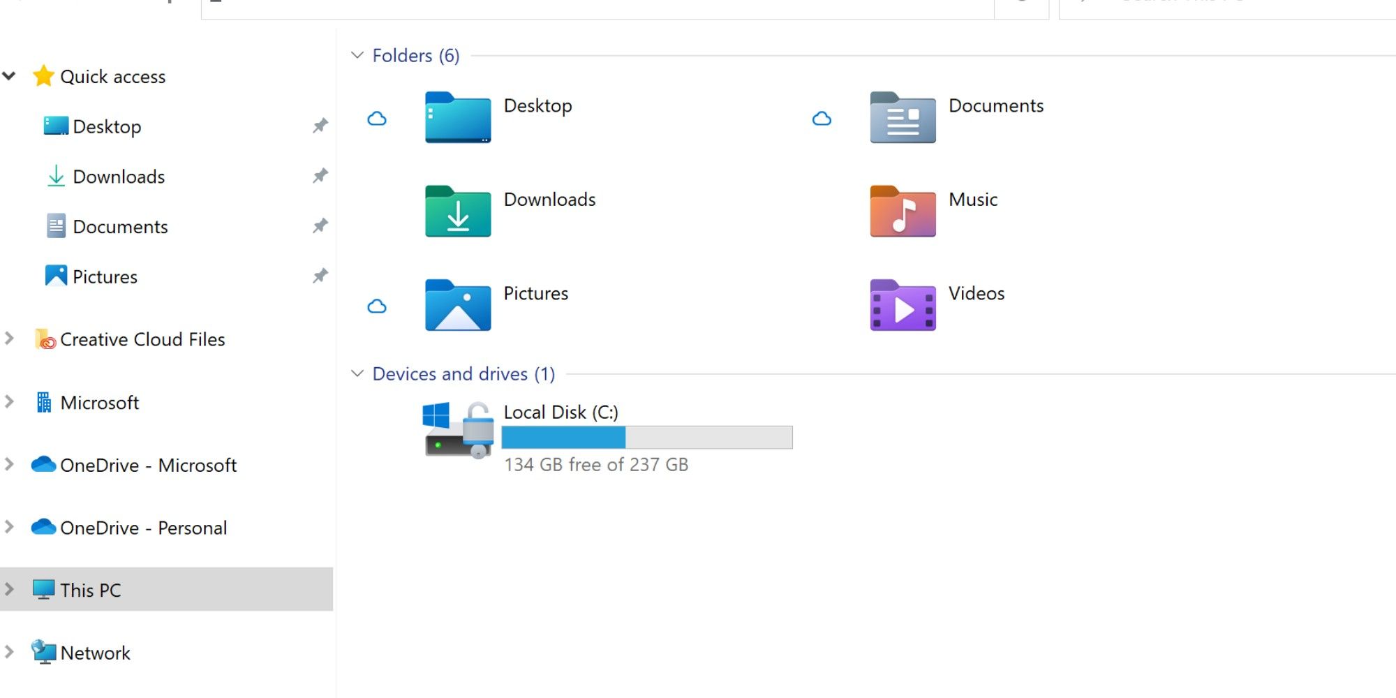
In a Windows blog post, Microsoft announced that several icons throughout File Explorer are being updated as part of the release of Windows 10 Insider Preview Build 21343. The announcement noted that some of the icon changes were made for "greater consistency across Microsoft products that show files." Among the icons getting updated in this latest release are Desktop, Documents, Downloads, and Pictures in an effort to let users more easily tell them apart. Not to be forgotten, the Windows 10 Recycle Bin got a fresh new look as well.
Change isn't easy, but from a technological perspective its often a necessity in order to progress and adapt alongside the rest of society. Microsoft has certainly been trying to shed Windows' reputation as a dated-looking operating system for some time now. So, while icons may not seem like a monumental update in the grand scheme of things, they are important as the company actively tries to shift the aesthetic perception of its popular OS. On that note, the new icons are more modern and - for the most part - better looking than their older counterparts. The Recycle Bin icon no longer has the dimensional look of its older, slightly sideways icon, with the updated straight-on version looking sharper and more defined. The same goes for the disk drive icon, which has also shifted to a more head-on aesthetic approach.
The new folder icons may take some getting used to, however. It is not that they look bad - they once again follow the modern angle Microsoft is going for - but so many Windows users have likely gotten used to a slightly open yellow folder with a picture icon peaking out. The updated Pictures folder combines that look, and it will eventually be easier to quickly differentiate between key folders. It just may take some time for many Microsoft Windows 10 users to get acclimated to the new look.
Source: Microsoft
from ScreenRant - Feed https://ift.tt/2PnYqvd


0 Comments
Please don't use vulgar comments and avoid discussion on Religious matters